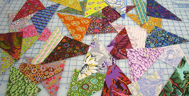
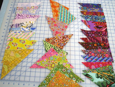
Make Every Quilt Design Pop with This Value Tip

The Key is How Medium-Value Fabrics are Combined!
Have you ever selected fabric for a quilt, or combined scraps, only to lose important design elements once it was stitched together? Chances are that had little to do with the colors you chose and a lot to do with the values.
It’s easy to focus on color when choosing fabric for a quilt. Unfortunately, the values of those fabrics (light vs dark) can fall by the wayside. But, it’s the value contrasts that usually define the design of a quilt.
While it’s easy to place dark next to light, what about those medium-value fabrics? They are often the key to whether the design pops or gets lost.
Get those medium-values right and the overall design will sing, whether you’re using a coordinated color theme or scraps.
Wanda from Exuberant Color has an easy way to combine fabrics of different values so you achieve contrast where it’s needed in the quilt’s design. It’s a quick lesson that’s super easy to understand and remember.


